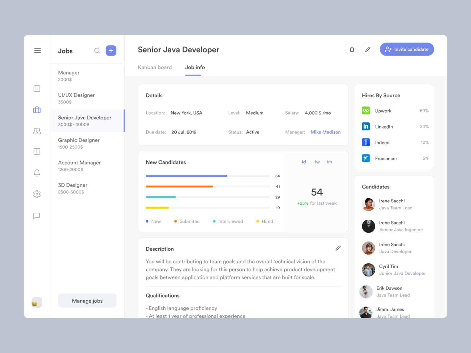
Stay Nimble
Stay Nimble uses psychology and data that helps users find their skills, strengths and values. Bundled with human career coaching maximises the chances of finding better-paid work.
Challenge
We want to empower users through career changes and see them through the whole process at scale.
Working closely with our users, we mapped out the highs and lows of career changers; specifically those who come from disadvantaged backgrounds to inform our product.
My impact
- Led numerous sessions with our users to generate opportunities and validate hypotheses’.
- Provided high-fidelity prototypes that proved to make an impact.
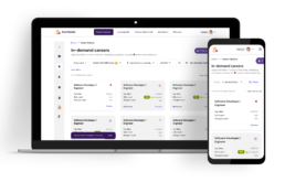
- Created a full end-to-end journey with bite-sized steps. We celebrated achievements at scale without users.
Wins
- Grew our user base from 1,000 to 11,000 users.
- Created a step-by-step process to be the building blocks of any career change.
- Increased retention by 78%. Users had clear jobs to be done.
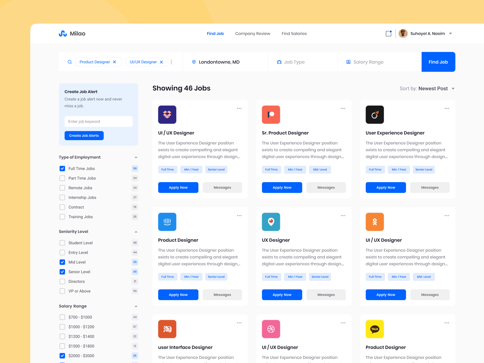
Identifying the problems
- There’s a fundamental problem in finding a potential new career. Users were unable to search; filter; and compare between different roles easily.
- We knew our users had careers they would never want to do but had no way of expressing this in the product.
- Users had preferences in skills, which they expressed in another journey. However, this was not taken into account anywhere.
Limitations
Most of the data points come from external sources. There were a lot of development restrictions that the design had to solve.
- A skill can take many months; or even years to master. There was no way of knowing how long it would take to become “good enough” at a skill and succeed in a new career.
- Data accuracy was monopolised by one data source. We were aware of potential risks such as dated information; new market conditions; and natural disasters (e.g. COVID) would take many months to learn about before being available.
Research / Inspiration
I began researching to see if anyone out here has solved the issue we’re experiencing. It all started with our competitors. I rummaged through to see who has the same offerings as us, and how they are displaying their careers. Truth be told, it was a dead-end!
The specifics of suggesting careers were so niche. Next up! Who suggests things the best?! There were limited places that came to mind which were still in the career space.
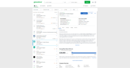
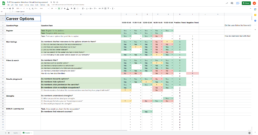
Glassdoor
- Great job at showing a preview of the job before a user would want to find out more
- Great job at showing information about the company that is hiring
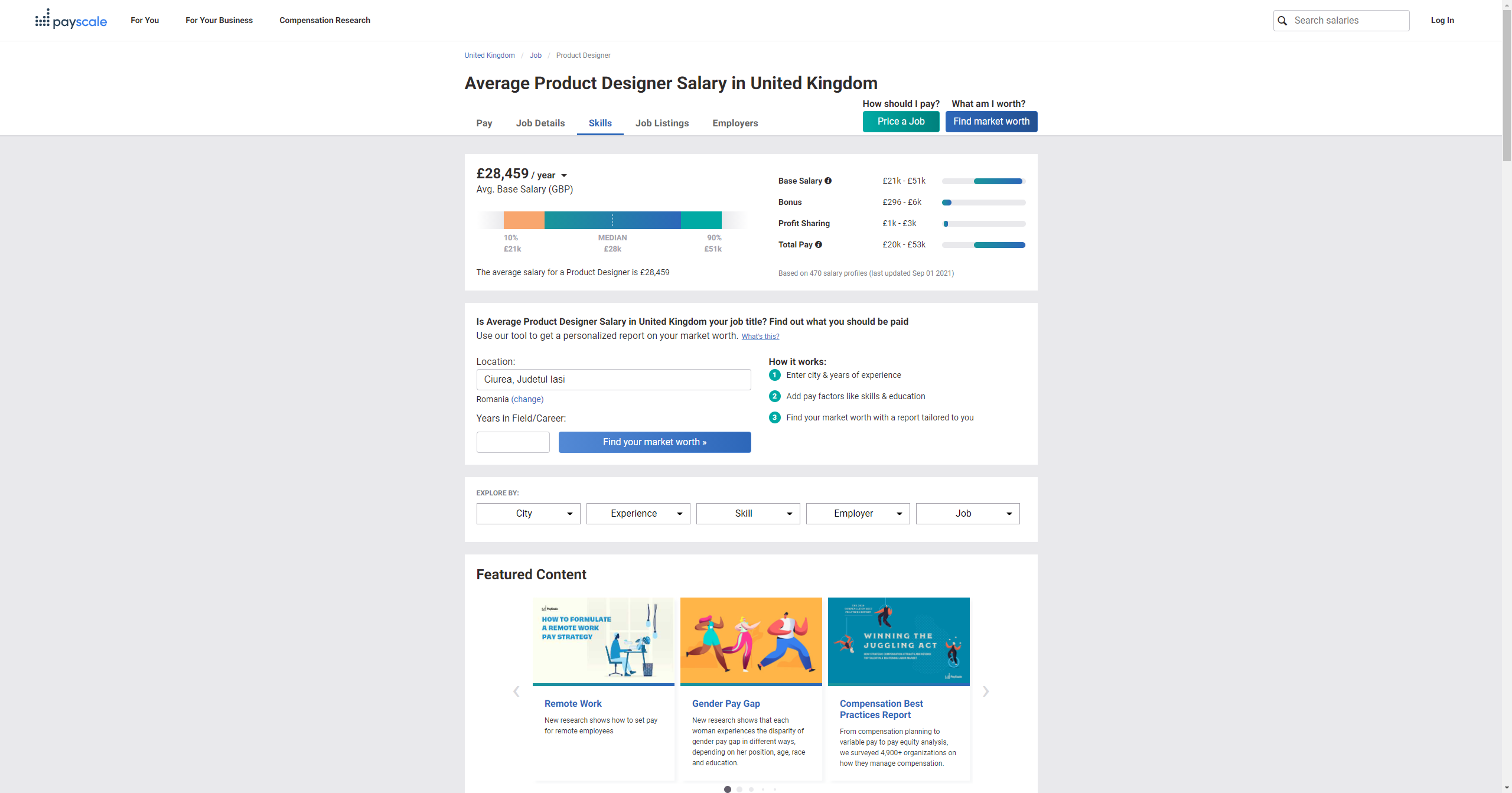
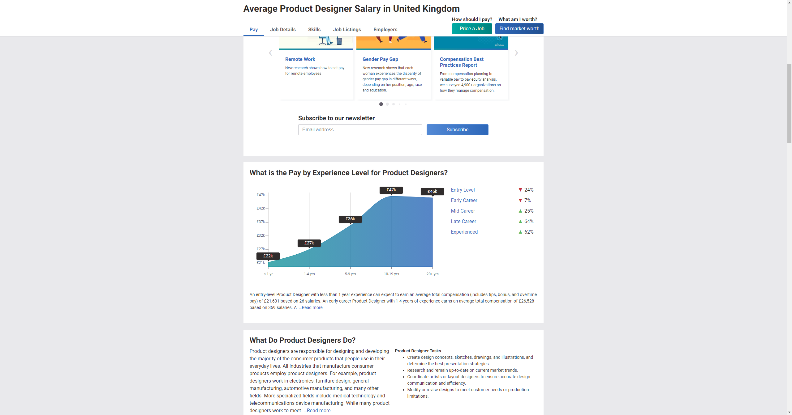

Payscale
- Great at showing the average salary across different experiences
- Great at explaining the role
- Great are showing job satisfaction
- Great at showing popular skills needed for a UX designer
- Great at showing different career paths that users can proceed into.
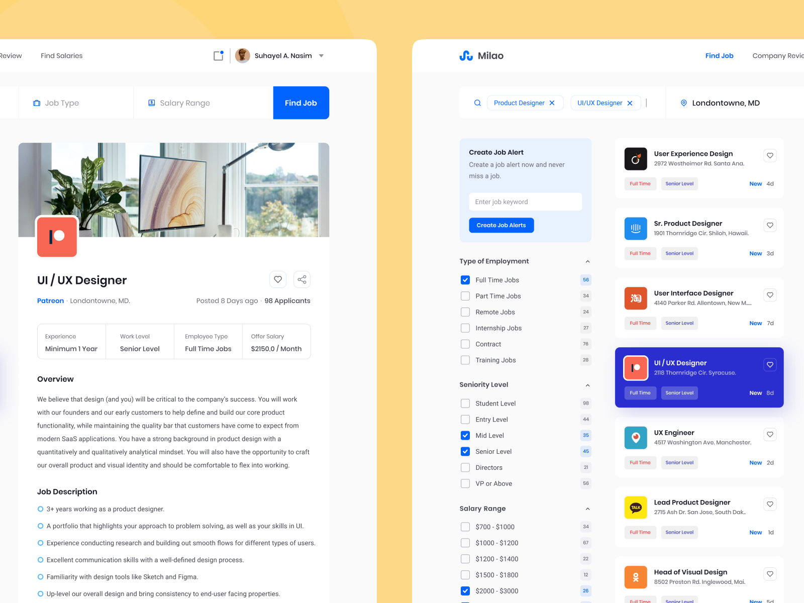
There were great UI designs on here. Although they aren’t a tried and proven concept, they still provide a great way of showcasing data.
Mapping out what members want to see
I took a look as to where we can source information that is accurate and available. There was an audit done by myself playing with Postman with the API sources where we get the data from however I am unable to show this.
I did not have a way to see what our members were doing during the time this was created. We hadn’t implemented Hotjar at this point. Instead, I approached our coaches to understand how members are using this section of the product. They were more than helpful to provide insights into what a member is looking for.
At this point, it was a safe bet to get our developers opinion on the data sources to validate use cases.
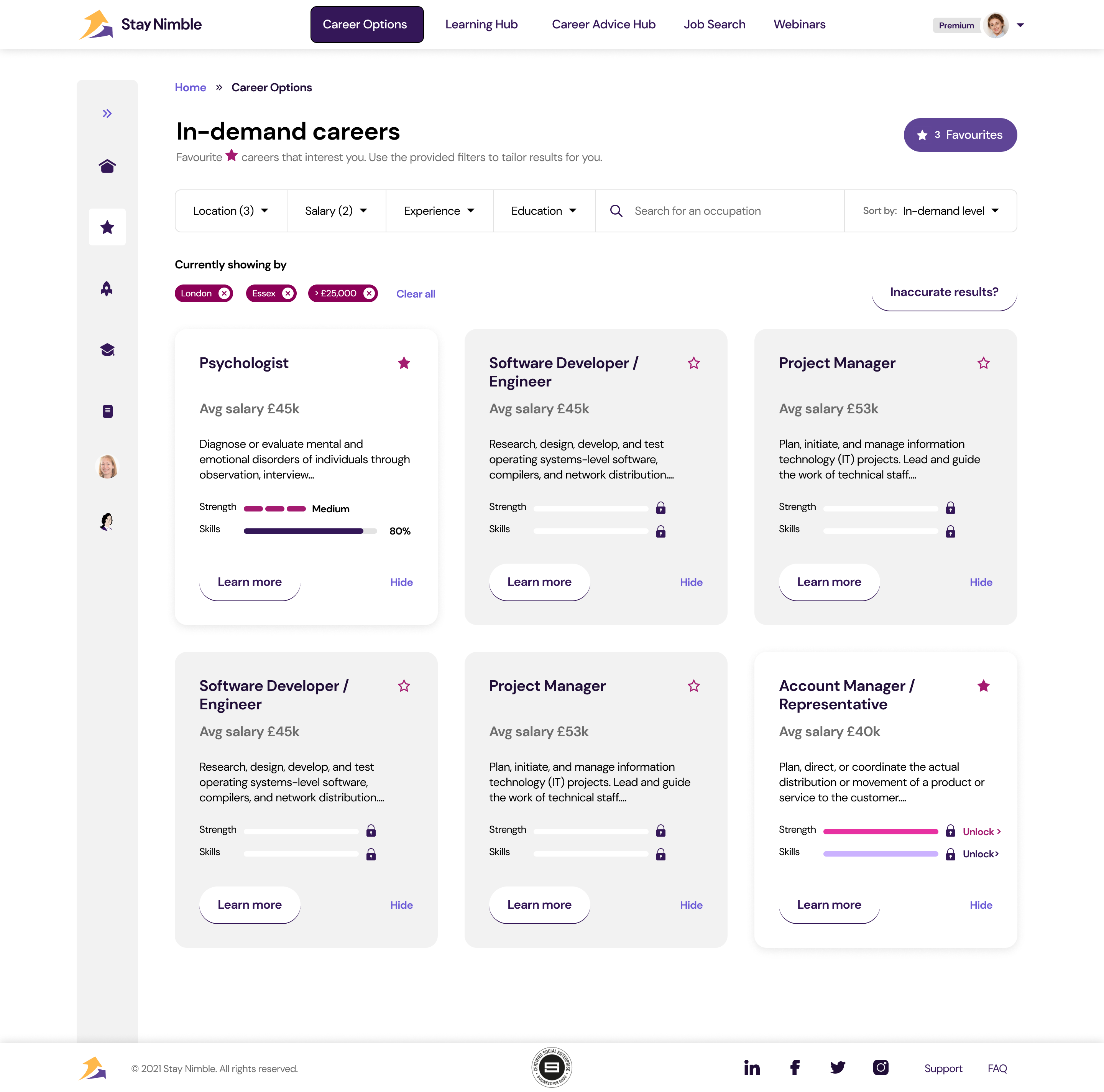
I also took a look at the filters based on the research I completed and what the coaches mentioned.
Paywall & Edge cases
There are certain things a member would need to upgrade to see. I took some time to think about some options we have to increase conversion. Some data is needed to power the suggestions. If the member hasn’t completed their skills or strengths journeys, they would see a limited data set. I took into account how this works.
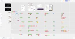
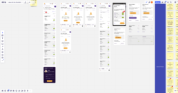
Design
With a style library already set up, I started working directly into Figma. A lot of design choices were already made; icons, illustrations, and typography. It would have taken longer to draw designs out on paper.
There’s were… more than a few iterations to get it looking and working the part.
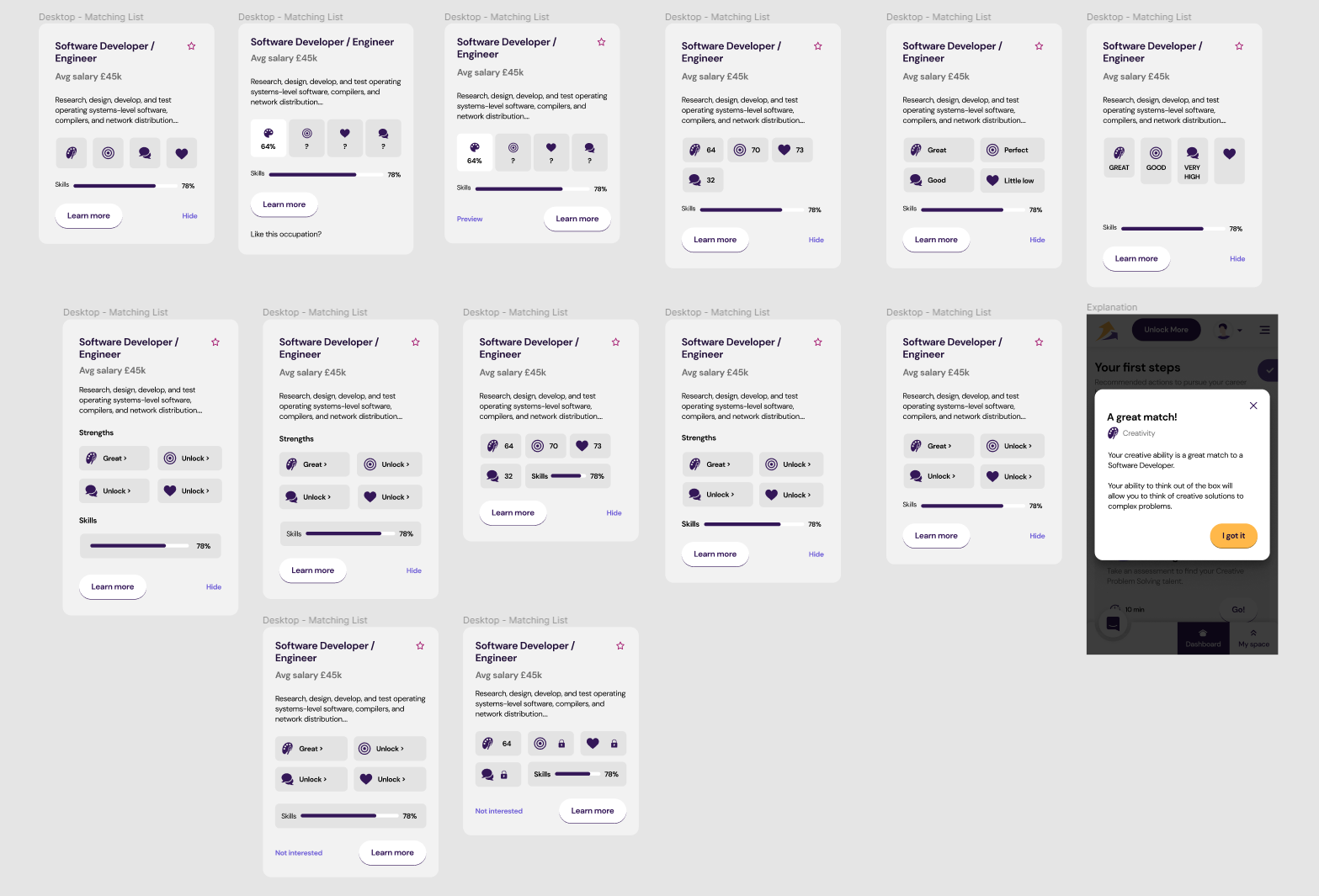
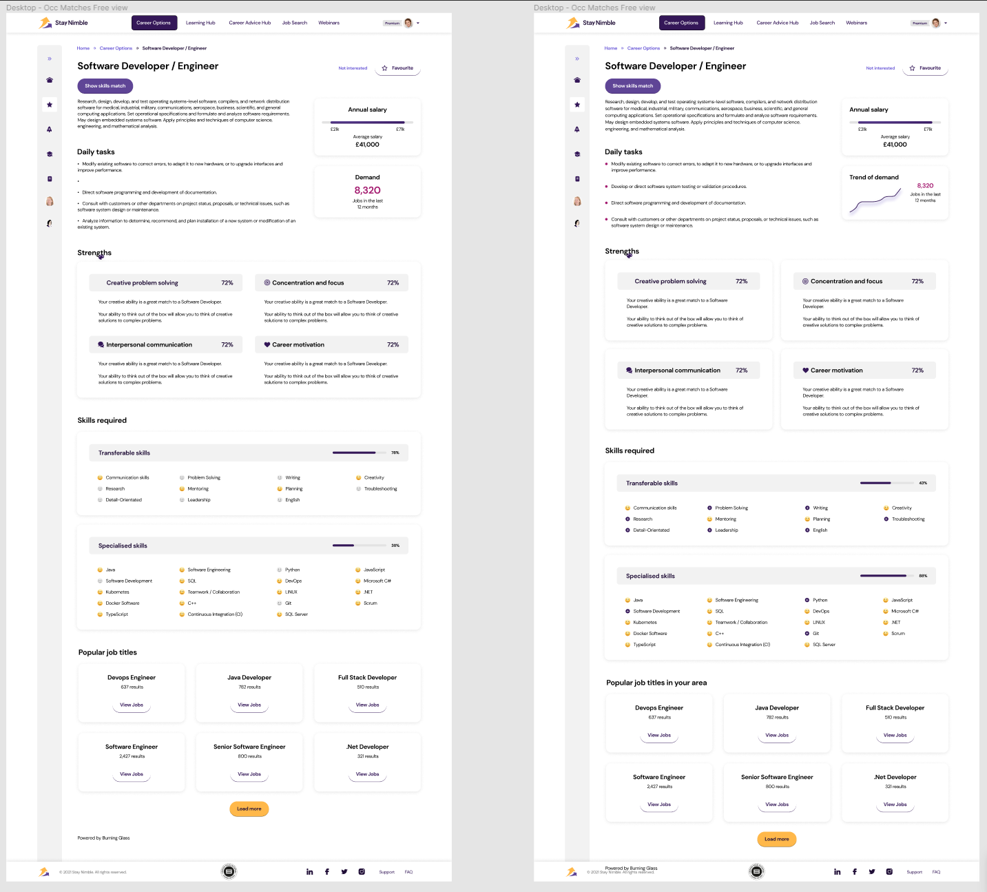
After design finalisation, I began to work up the prototype and shared it internally for review before working on the next step.
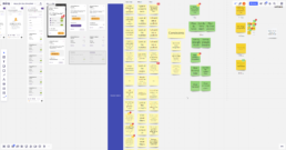
User testing
After we internally reviewed the prototype, I organised a testing session with our existing userbase. With around 5,000 members at this time, I knew I needed to pick active members who have favourited a role.
After sending them a message, they were able to book a slot in calend.ly.
In the meantime, I organised the testing scorecard (quantitative feedback) & Miro board (qualitative feedback).
Development
The developers were already closely following along the progress for the new career’s pages. I organised a hand-over session where I linked the prototype and exported every screen that was going to be worked on so we could discuss things in more detail if needed.
We also had a section for capturing the acceptance criteria, most of which was pre-filled by myself to save time.
After a week, the design was handed back over to me to test against the acceptance criteria. There were a handful of bugs that were reported and fixed. After one last thorough test, we released the feature for everyone to be taken advantage of.
Success metrics
We let the feature sit live. Within two weeks we saw:
- 87% of our users interact with careers. Whether that be saving them, or hiding them.
- 43% increase in users pairing with career coaches which led to informed conversations.
- Feedback directly from users going out of their way to message us how amazing the recommendation engine works.